In 2024, I began a meaningful collaboration with Costa Rican silversmith Dani Coto to create the brand identity for her jewelry studio, Cuatro Elementos. Nestled in the lush jungle and coastal beauty of Nosara, Dani crafts bespoke silver pieces that embody her appreciation of the natural world around her.
Working together with Eva has been one of the most enriching and rewarding experiences I have personally had, both for myself and for the brand. She is an alchemist when it comes to design perception, and with her sensitivity & creativity she guides you to gather everything necessary to achieve results that are most aligned. I am more than grateful for this collab and opportunity.
—Daniela Coto, Owner Cuatro Elementos
Elemental Inspiration
The name "Cuatro Elementos" was our creative compass throughout the entire branding process. These four elements—earth, fire, water, and air—not only inspired Dani's artistic approach but became the foundation for the visual language we developed together for her brand.
Crafting the Perfect Mark
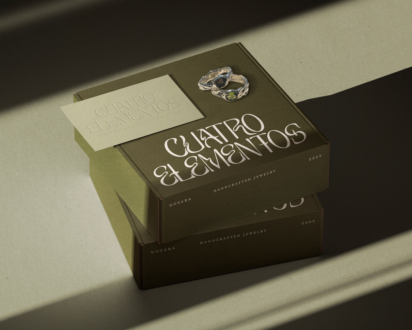
For the logo, we selected an elegant organic typeface with a distinctively fluid character that immediately sets the brand apart. I carefully crafted the letterforms by introducing subtle graphic details that evoke the essence of liquid silver, dancing flames, flowing water, and gentle breezes—creating a visual representation of both Dani's craft and her brand name.
Dani expressed her love for the brand initials, CE, and wanted to make sure we were honoring this simplification in the brand design. I explored various ways of bringing it to life, finally we landed on a beautiful monogram where the mirrored C and E are smelt together, with a small sparkle or flame rising above.
A Natural Palette
The brand elements and color palette draw directly from the natural world that surrounds Dani in her creative practice. Beyond the four classical elements, we incorporated visual references to the metalworking process—the glow of heated silver, the patina of oxidation, the raw textures of unworked materials.
Aesthetic Alchemy
The resulting brand identity presents a moody, aesthetic vibe that feels simultaneously powerful and feminine. It speaks to the handcrafted nature of Dani's work while maintaining a careful curation. The visual system we created allows her jewelry designs to remain the focal point while providing a distinctive backdrop that reinforces the brand's connection to natural elements and artisanal hand-crafting.
This project is a reflection of my approach to brand identity design—honoring the client's vision and inspiration while translating it into a cohesive visual language that feels authentic and aligned to their unique offering to the world.
Follow Cuatro Elementos →


