La Catedral is a sanctuary of authentic intimate luxury, where mystery and discovery intertwine. It’s a haven for the curious and discerning, a concept space layered with treasures waiting to be uncovered. Every detail whispers of thoughtful curation, personal connection, and an invitation to create and experience something magical together.
Eva did an amazing job on the branding of La Catedral, she understood the concept the minute we met, she is an incredibly intuitive, talented artist, that listens very well. It was a blessing to work with her.
—Lisa Baehni, Co-Founder La Catedral
A Visual Pilgrimage
I was tasked with no easy feat; crafting the visual identity for a unique experiential, cultural and artistic space where the community can converge and enjoy. After meeting with the clients, Lisa, Luca and Robbie, to get an idea of the vibe of La Catedral, I set out on my visual pilgrimage.
As I began on my journey, I found the need to define some foundational brand elements. As I did my research, created moodboards, and pored over the materials my clients had given me, I started to get a clearer picture of where the brand could be leading us.
The brand's visual pillars were then raised:
- Earthy Elegance
- Textural Layers
- Soft Light
- Handcrafted Typography
- Antique, yet Modern
- Illuminated Icons
- Cross-Cultural
- Patterned and Textured
La Catedral was starting to take shape! Drawing from the handwritten notes and text clippings that Lisa had sent me, I was able to capture and refine the brand tone of voice, to finish setting the stage for La Catedral's personality.
La Catedral speaks with an intimate and evocative voice that blends refined elegance with cozy familiarity. It is grounded in the authenticity of lived experiences and elevated by the allure of the extraordinary. The tone is imaginative yet approachable, with a focus on storytelling that invites guests to savor life’s treasures—whether through shared meals, curated objects, or moments of quiet reflection. Each word feels tactile and intentional, crafting a sense of connection, nostalgia, and discovery.
Once we had defined the foundations for the brand, I began collecting visual inspiration to craft the moodboards which would help define the visual look and feel. I drew on inspiration from antique hand-painted ceramics, blockprints, mysticism, illuminated icons, and hand-lettering. I discovered the mood for the brand at the intersection of French, Italian, and Latin American visual cues.
La Catedral
The logo is a custom hand-lettered font, inspired by antique prints and signage. It is tall and elegant, yet slightly irregular, thus exuding a unique personality. The tagline font is simple and modern, which helps balance out the antiquity of the logotype.
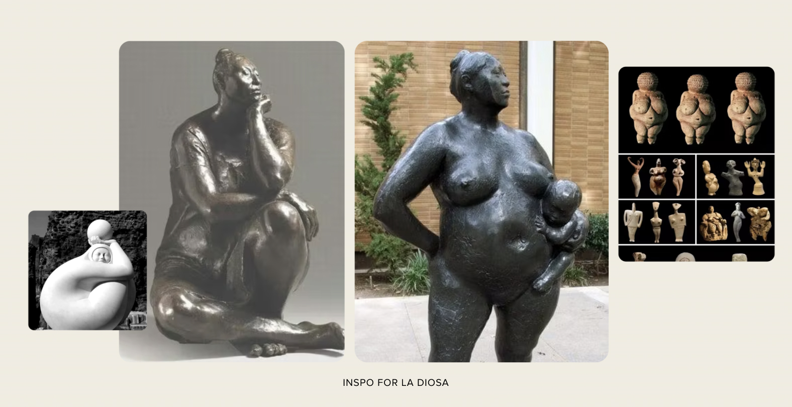
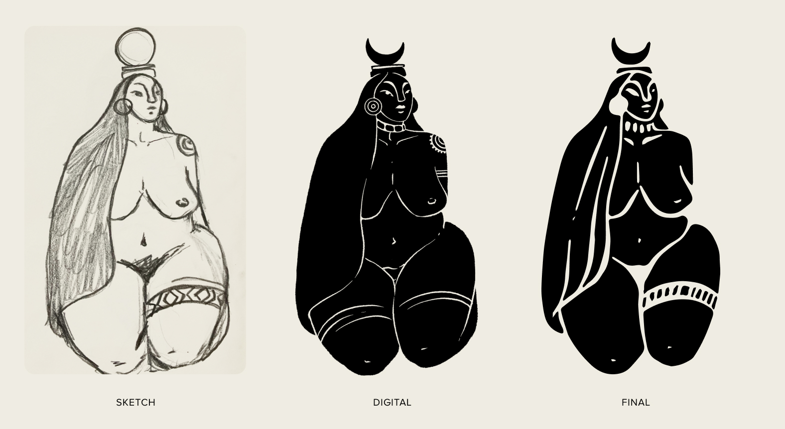
La Diosa Yaxa
La Catedral's goddess, La Diosa Yaxa, is an icon inspired by the chorotega indigenous culture. La Diosa is voluptuous and alternative, she symbolizes creative fertility and connection to our ancestral roots.
The figure of the goddess is inspired by the art of costa rican artists Francisco Zúñiga and Jorge Jimenez-Deredia, I also drew inspiration from the Venus of Willendorf, and the representation of the Mayan goddess Ixchel.
La Diosa Yaxa has become the icon of La Catedral, acting as a beacon in the mountains above Nosara to all that are called to make the pilgrimage in her honor.
Guanacasteca • Chorotega (Indigenous) • Voluptuous • Sensual • Free • Creative • Iconic
A Creative Haven
The brand identity for La Catedral is fun, colorful, and creative; a true reflection of the vibrant space they have created nestled in the mountainous jungle above Nosara. It was an absolute honor to craft the brand identity for such an inspiring creative space. If you're ever in Nosara, you have to make the pilgrimage up to witness La Catedral de la Diosa Yaxa.